ART DIRECTION
I lead creative direction for food and lifestyle brands that want to stand out with intention. From branding and packaging to menus and editorial layouts, I shape cohesive visual strategies that connect story to design. Every project blends strong storytelling with refined details — ensuring your brand shows up consistently, memorably, and with impact.
As co-founder and creative director of Edible Vancouver Island, I established the magazine’s original look and feel — setting the tone for a fresh, west coast food publication. From typeface selection to layout systems, I built the design framework that carried through every issue.
For this issue, I directed the visual storytelling — overseeing photography, styling, and art direction to ensure each feature captured the spirit of Vancouver Island’s food culture. The layouts were designed to highlight both the people behind the food and the beauty of the ingredients themselves.
As creative director, I guided a collaborative team of writers, editors, and photographers — ensuring consistency across articles, features, and advertisements. Every spread balanced engaging editorial design with functional clarity, resulting in a magazine that was both beautiful and reader-friendly.
I art directed the rebrand of Wild Poppy Market, starting with the core identity. From logo design to color palette and typography, the goal was to create a warm, welcoming look that reflected the owners’ values and positioned the market as both modern and community-driven.
The new identity was carried through every touchpoint — menus, signage, packaging, and in-store materials. By applying consistent design direction across print and digital, we built a cohesive brand experience that resonated with customers and strengthened Wild Poppy’s presence in the community.
A menu isn’t just a list — it’s a sales tool and a core part of the brand experience. For this project, I designed a bold, crave-worthy menu designed to reflect the restaurant’s playful energy. Clean hierarchy and strong visuals make ordering effortless while highlighting signature items..
For Wild Poppy Market, menus were designed to reflect their warm, community-focused identity. Tidal Café’s menus, by contrast, emphasized a fresh coastal aesthetic. Both projects show how thoughtful menu design can reinforce brand personality while improving usability.
For OEB, a brunch-focused brand with a growing presence, menu design needed to balance approachability with sophistication. I created layouts that showcased premium ingredients while making the wide range of choices easy to navigate — in print and on screen.
New look. Same great coffee.
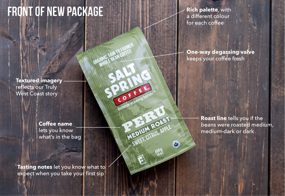
New look. Same great coffee. I led the redesign of Salt Spring Coffee’s packaging, refreshing the brand’s presence on shelf while honoring its roots. The updated design brought stronger legibility, modern textures, and clearer hierarchy — transforming how the product stood out in a crowded coffee aisle.
The refreshed system introduced textured imagery to tell a “Truly West Coast” story, a color-coded palette for each roast, and improved roast-line indicators for clarity. These details not only reinforced brand storytelling but also enhanced usability for customers choosing their blend.
As art director, I worked with a professional photographer and production team to ensure every detail translated from concept to shelf. I managed creative direction, design refinements, and prepared all print-ready files for overseas manufacturing — ensuring a smooth rollout across retail.


